Been working with a really fun project earlier this spring. Thought I´d try to give some brief insight in to part of the development process here, and some of the fun we´ve been having.
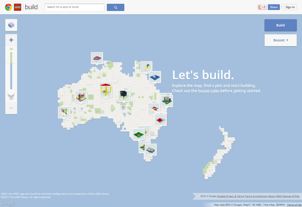
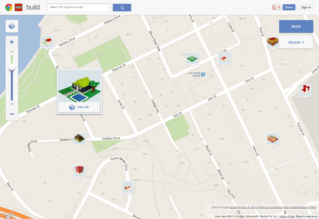
It can be described as a mash-up between Google Maps and LEGO®, where you can build LEGO on top of Maps. It´s called “Build with Chrome”. Here’s a YouTube video explaining it more visually.

We start out with what we call the “Discovery phase”. This is basicly where each dicipline tries to see the biggest challenges with the project and start exploring different options/paths/etc. Anything goes..
I saw two big challenges here. The first one being the builder, like how do you make some 3d-tool simple enough so normal people can use it. The second thing was how do you display peoples builds, several at the time without hitting to big performance issues.
We started with the second challenge.
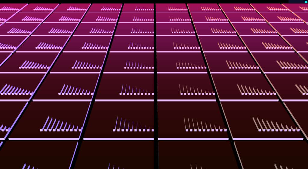
Having recently worked with particles, my mindset was set to that.. So my initial idea was to treat the LEGO bricks as particles or several particles makes up a brick, etc.. The idea is to use a sprite/particle of the smallest brick and so on. 1 vertex = 1 sprite. So this is not “real” 3d, but more isometric/ortographic, no perpective. Here´s the first test, so you can see what I mean:
(Small note. There is a bug with gl_PointCoord with certain older ati-drivers(like osx uses for example), where it flips the sprites vertically. Never bothered to fix a workaround, so if it looks weird for you, it´s probably that, and you should use the (flipped versions).)
Isometric 1 (flipped)
I wanted to get rotation in there. So we rendered out a png-sequence of a 90 degree spin, then based on the viewing angle we update the sprite texture. Here´s and example of that:
(Mousedown and drag left/right)
Isometric 2 (flipped)
Tested to snap to predefined angles, as it looks a bit weird looking from the front when there is no perspective.
(Mousedown and drag left/right)
Isometric 3 (flipped)
A first test to use an actual dummy model.
(Mousedown and drag left/right to rotate, drag up/down to move camera)
Isometric 4 (flipped)
One of the early ideas was to have some sort of terrain variation, here´s a test of that:
(Mousedown and drag left/right to rotate, arrowkeys to pan)
Isometric 5 (flipped)
More dummy models testing:
(Mousedown and drag left/right to rotate)
Teapot (flipped)
Torusknot (flipped)
NK Logo (flipped)
NK Logo zoomed out
For comparing techniques
(Mousedown and drag left/right to rotate)
Isometric 8 (flipped)
A test to mix in real geometry and to not have sorting issues against the sprites.
(Mousedown and drag left/right to rotate)
Isometric 9 (flipped)
This was sort off a long shot track. So at the same time Mikael Emtinger was working on the more classical real 3d approach. But with a twist. So he also saw the challenge in how to draw potentially lots of geomtery in a really a optimized way, or as few drawcalls as possible.
The idea is basicly to construct the geometry in the shader. So the “geometry” is basicly a cube that is defined as a uniform. Then the geometry is “built up” in the shader with an attribute stream, with sizes, offsets and colors being sent in.
He started out with a texture stream, but then converted to a attribute stream for compability-issues, but kept the idea of storing models in a bitmap, like using rgb-channel, pixel values for width, height, depth, x, y, z, colorindex, etc.
The pegs in this approach is done with “camera mapping”, basicly a high poly peg is rendered to an offscreen buffer at the current camera angle and then that is used as a repeated texture. And this is basicly what is used in the “explore” mode to display models.
There are drawbacks with each approach of course, but always good to have different directions. The client eventually wanted the real 3d approach.
Kind of a relief in retroperspective, not sure how we would have solved certain thing with the isometric approach.. ;)
So the next thing was to decide framework, since we had Micke onboard and he have developed Glow, we decided to go with that to be able to have an optimized render-pipeline since this is very much a single purpose thing. That is rendering LEGO bricks.
Still that needed much behind-the-scenes development to get to a point where we front-end-folks could make something nice with it.
So I started using my usual weapon of choice, Three.js, to prototype with, and by this time the other big challenge have been pushed on to my desk(#¤#!ers). The builder. I was a bit scared of this.. but it was just to “bite the bull” or whatever you say… ;)
So we entered what we call the “Definition phase”, the goal is to define what it is we should produce, functions, visuals, etc.
Started by trying to find inspiration in other similar tools, like voxel-editors, etc.. I wanted to find something really simple as the target audience here was normal people and not tech-savvy geeks. Saw something interesting in 3d-paint, a voxel tool, like you had a gridplane that you could move around, so it basicly became like drawing in 2d.
That was the first thing I tried.
Builder 1
The feeling of being able to “draw” bricks was kinda nice, but building something became quite weird.
So I tried with the more classical approach, that is more on par with the LEGO Digitial Designer, which is really nice, but it’s more advanced and more “cad” than what we were aiming for here.
Builder 2
How it works is that when you point the mouse to the top-surface, a invisible plane gets positioned on top of the brick and is sized and positioned depending on the target brick and the “in hand”-brick + rotation. So the ray hits that instead and you can position at any peg. Also made it auto-stack upwards.
Incremental version. Added preview pegs to the ghostbricks so you could more easily see where it would go.
Builder 3
One that tested autosaving with local storage.
Builder 4
A version with more bricks, updated dummy-gui, also thin bricks.
Builder 5
A version with real pegs added. Also trying to figure out how to deal with tall builds, hence the y-slider in the top-right corner.
Builder 6
Added the sloped bricks.
Builder 7
Test with a maps-texture. In animation and more..
Builder 8
Real pegs on the baseplate.
Builder 9 (Also experimented with different thickness of the baseplate, 1 and 2)
Visual tweaks, trying to get the ADs/gfx people happy… I saw mission impossible 4 that night btw.. just sayin…
Builder 10
More functional things. Like the predefined angles for example..
Builder 11
Also tested different sizes of the baseplate, like this. You can change the querystring there.
So now Micke had gotten to a point with his LEGO-version of Glow, dubbed GLego, that it was time for me to stop prototyping and build it “for real”. The production phase. Which basicly meant tearing everything down and start from scratch, using GLego instead of Three.
Might add that I had hard time explaining this to PMs, ADs, clients, etc… “But it´s working…, We´re almost there!” Anyway…
I got up to speed pretty quickly, Micke had done a great job, and I constantly bugged him for new features/fixes etc.
And here´s a first version of GLego-version that I showed:
GLego Builder 0
An incremental one with loads of fixes after feedback, etc.
GLego Builder 1
And the last one using my horrible dummy-gui. Added environment mapping and more.
GLego Builder 2
From there on it went in to the app-engine version, where a real gui was applied, bugfixes, small tweaks, changes and so on. And eventually it became what is on the live site.
Live Builder
This was LOADS of fun to work with and I´m quite alright with how it turned out, for once.
LEGO and WebGL in one project is like a real nerd-fiesta..
You can visit the full thing at: Build with Chrome
(Official Google blog post)
As always it´s a collaboration between many parties. We at North Kingdom. Agigen helped with both the backend and html/css-frontend. Mikael Emtinger did the WebGL framework, shaders, etc. Mark in Australia was the agency client together with Google Chrome and LEGO. The clients were really cool btw. (which is freaking rare…). ;)
And if you read this far I can give you some pro-tips regarding the Builder. You can change colors with the 0-9 keys on the keyboard. There is also a “special” hidden “my-little-pony-inspired” color(easter egg) available if you do a certain key-combination(or go by the console). Rotating bricks is quickest done by using the left/right arrowkeys… And that´s about it!
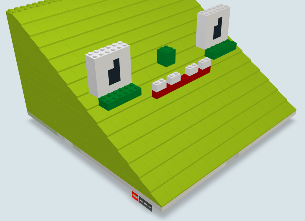
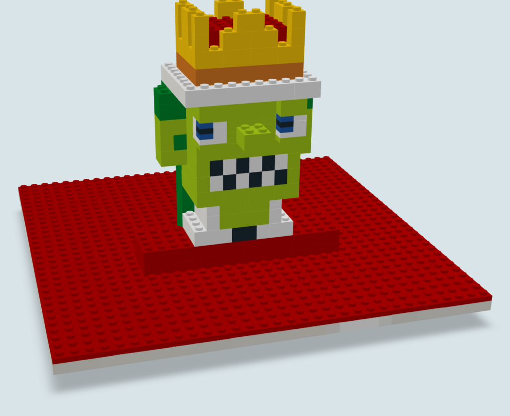
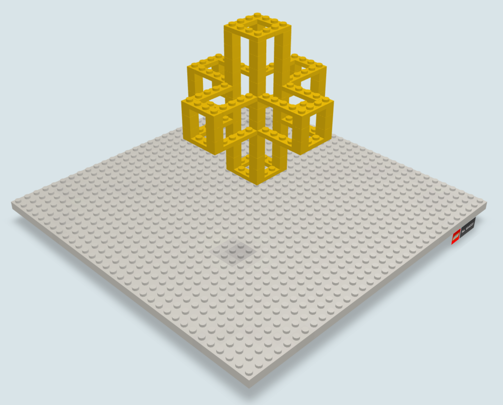
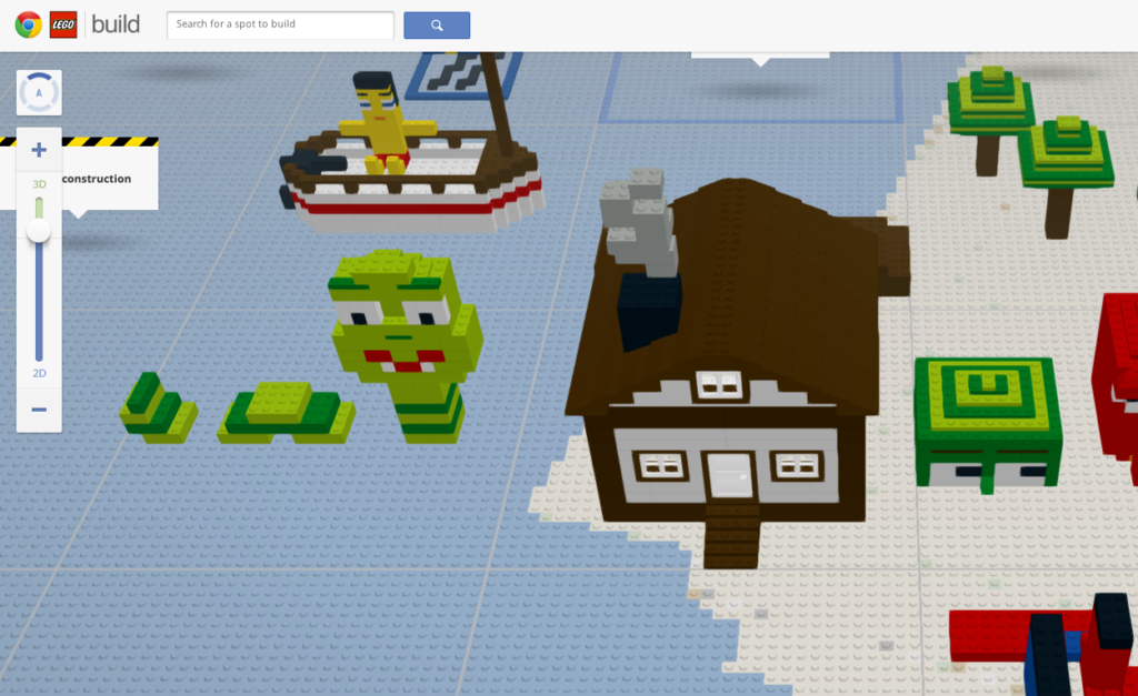
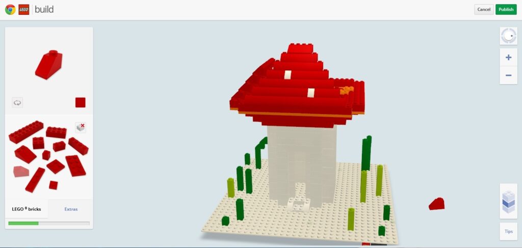
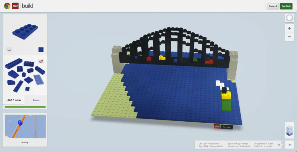
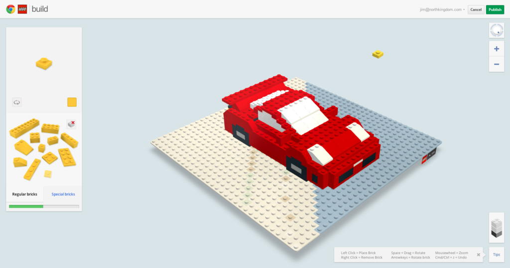
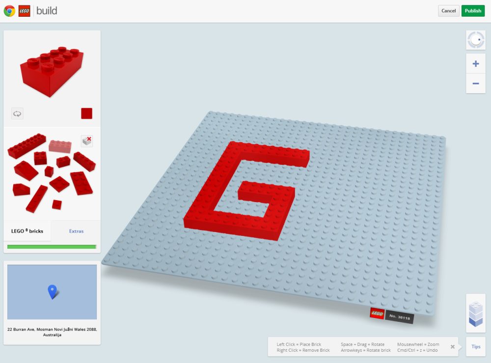
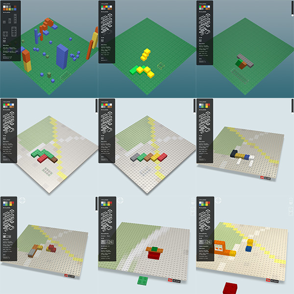
Also here´s some various screenshots of WIP/testbuilds/failures/etc. (Click to enlarge them).


Hey! really enjoy the site the first time I saw it! This is an excellent post! by the way, you tiles 2d tutorials are still in my favorites since I started flash long time ago! congratulations!
Fantastic app! It feels fun to play with even from your earliest prototypes. Thanks for taking the time to fill us all in on the process.
Great work and app, although it’s getting laggy exploring other people’s work. I don’t understand why everybody let flash down when it’s performing better than js.
Thanks for the posts and the great tutorials !
This is just awesome, really nice usage of webgl.